
Craiglist
Overview
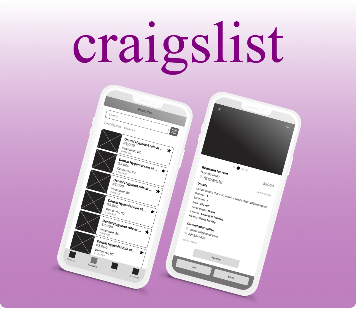
The Craiglist app allows users to access free classified advertisements for categories such as housing, jobs, resume, gigs and so on.
Role
UX Designer
Tools
Figma, Miro
Problem Analysis
I have highlighted the main UX issues below:
- Redundant steps
- Missing margin on some screens
- No App screen for some features – redirects to the webpage
- Confusing flow
My Solution
In order to solve the issues I have highlighted, I have simplified the flow for different parts of the app such as the account section which also helped to remove some redundant steps. I have also designed the wireframes for the features that do not have a screen in the app.
Current User Flow vs My Redesign
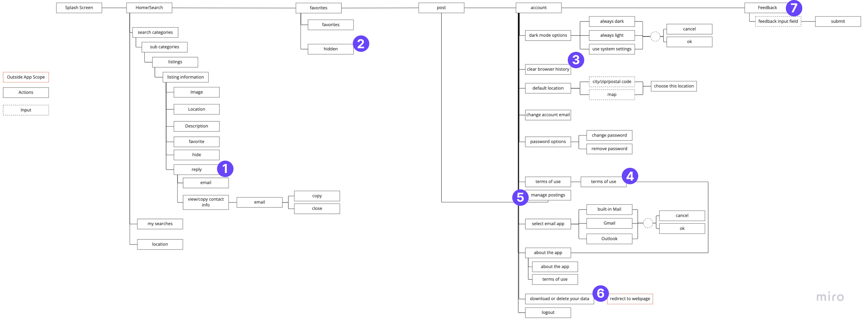
Current User Flow
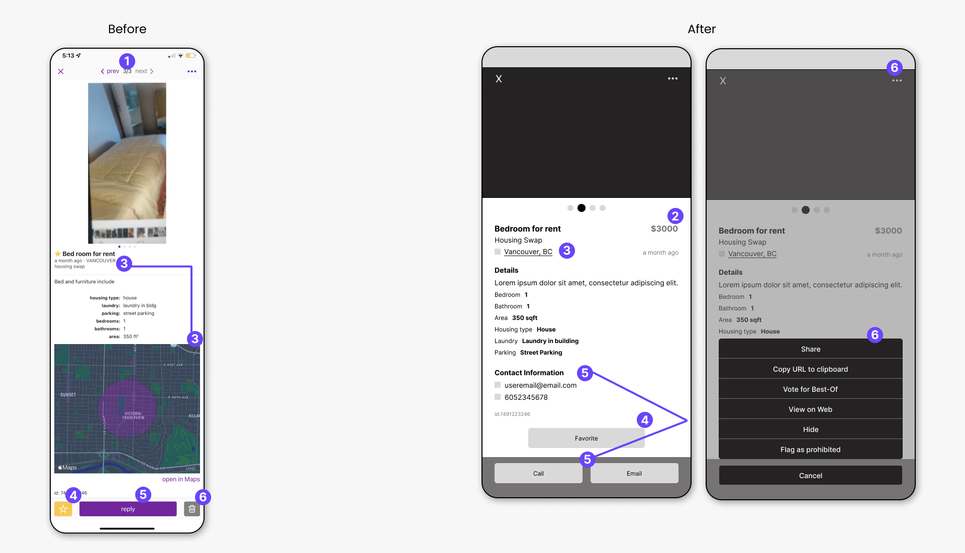
- This feature is redundant to the user. In other words, the user is not able to send a message to the owner in the app. The user is only able to view the email address and be redirected to an email app on the user device.
- The “Hidden” section is unrelated to the “Favorites” section so it was removed and placed in the “Account” section
- In the app, this is a button that clears the search history. There is no confirmation prompt to ensure that the user did not click the button by mistake.
- The terms of use section is redundant here because it is also available in the “About app” section.
- The “Manage Postings” section is not necessary here because it only redirects the user to the “Post” section of the app.
- “Download or Delete your data” redirects the user outside of the app.
- The “Feedback” section is not a main feature of the app, therefore it was moved to the “Account” section of the app
My Redesign User Flow
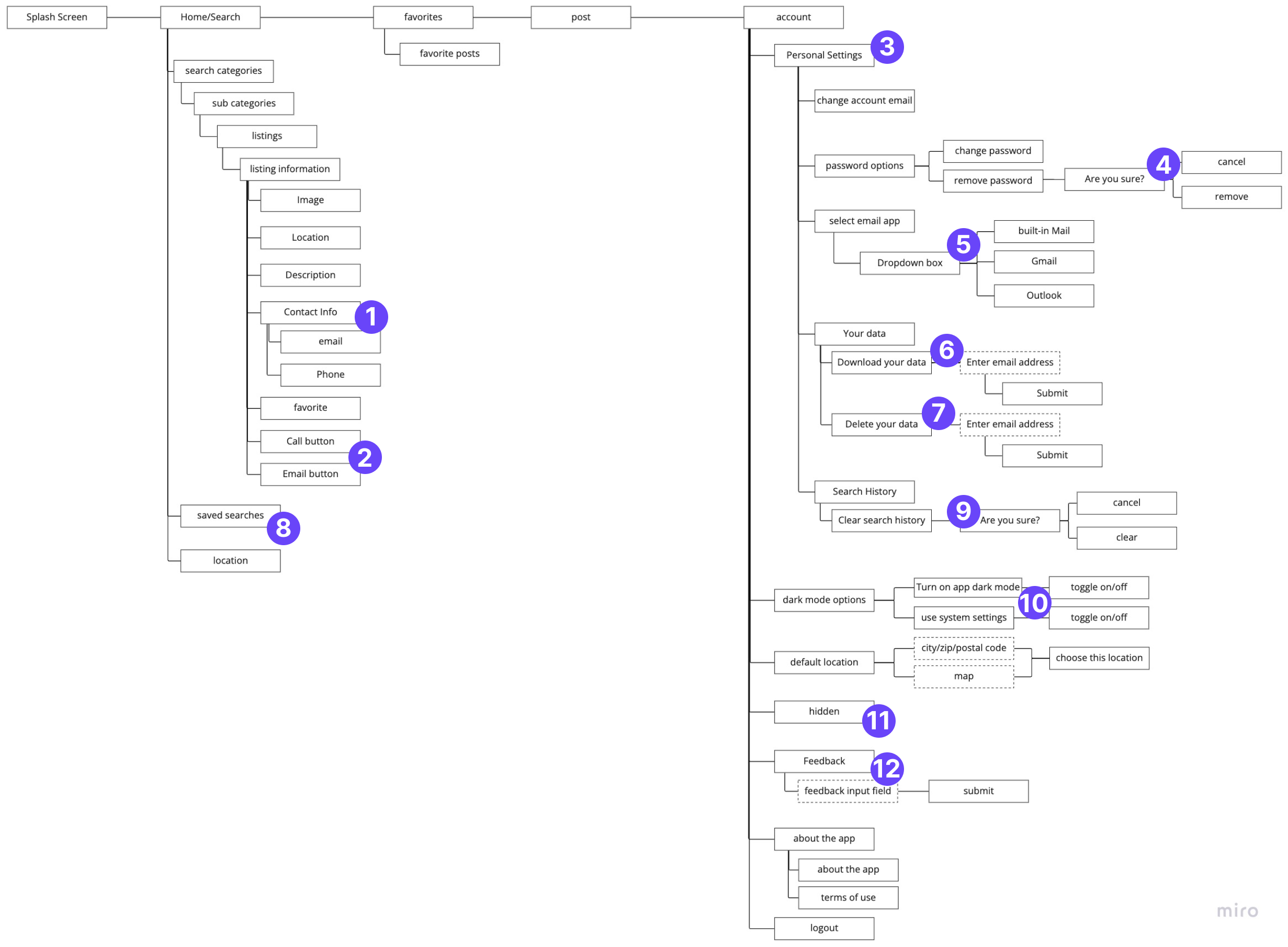
- Instead of the user clicking the reply button to view the contact information, it is made visible on screen along with the rest of the listing information.
- The user has easy access to contact the owner with the call button or email button.
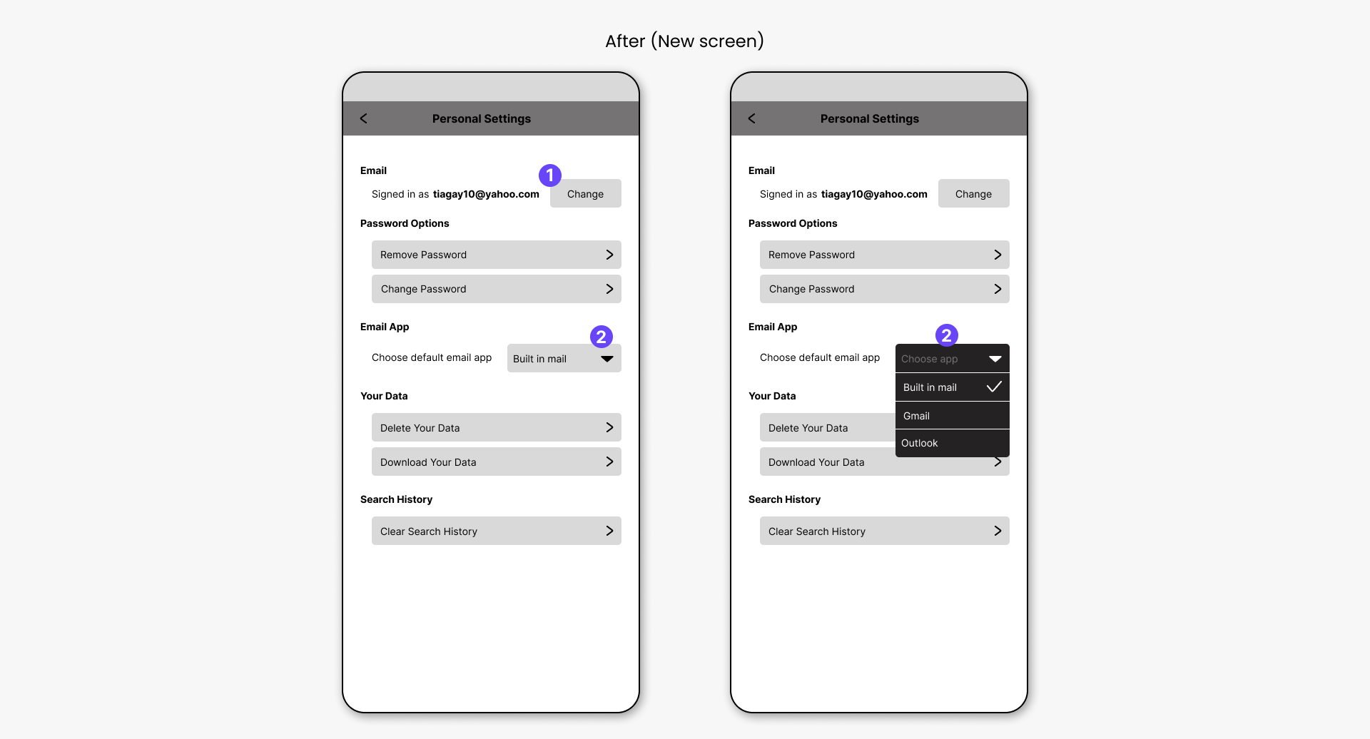
- The “Personal Settings” sub-section was created to group some of the settings from the “Account” section, instead of having all he settings on different pages.
- If the user was to click the “remove password” button, the password would be removed without confirming with the user. Therefore, a confirmation prompt was added to minimise errors but user.
- The app options are given to the user as a dropdown list
- Users are able to delete their data without exiting the app
- Users are able to download their data without exiting the app
- “My Searches” is renamed “Saved searches” so that it is more specific for the user
- A confirmation prompt is added.
- Minimized the number of options the user has
- & 12. The “Hidden” and “Feedback” sections were moved to this section of the app
Current App UI vs My UX Redesign
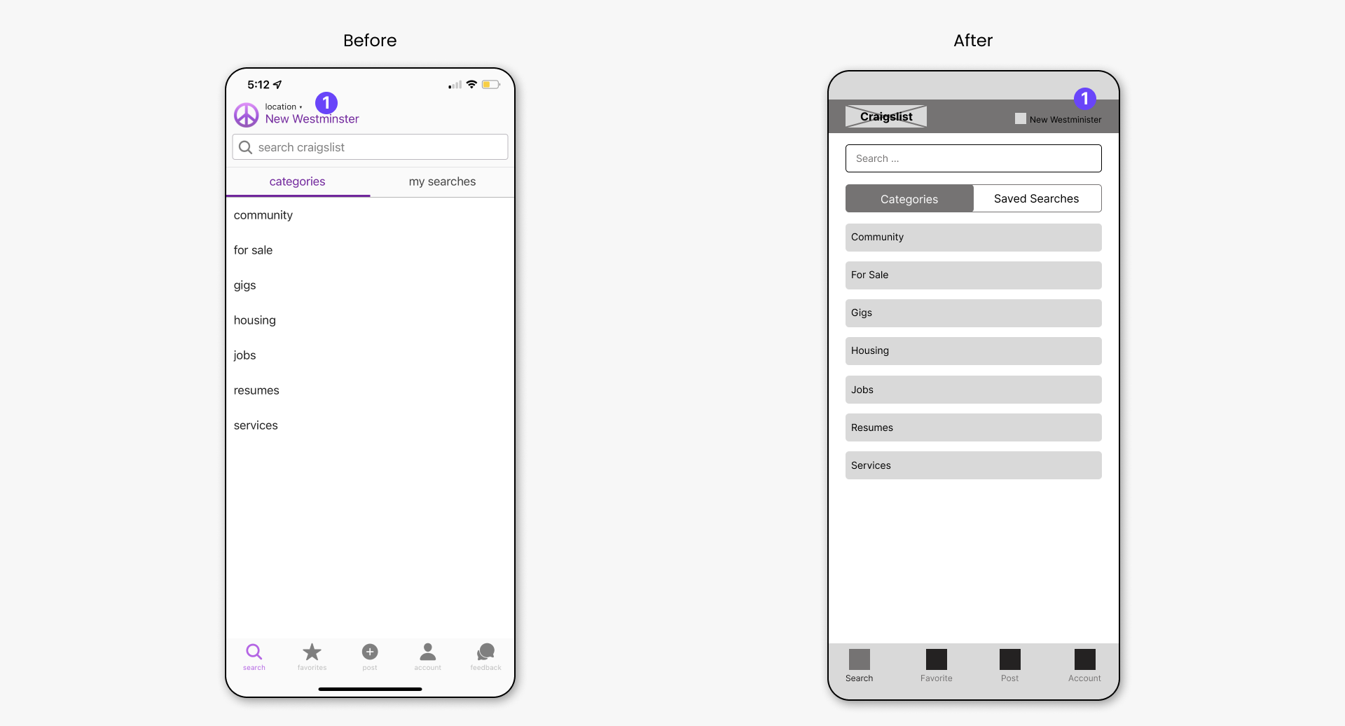
Search/ Categories
- The location was moved to the right of the screen to set it apart from the app logo.
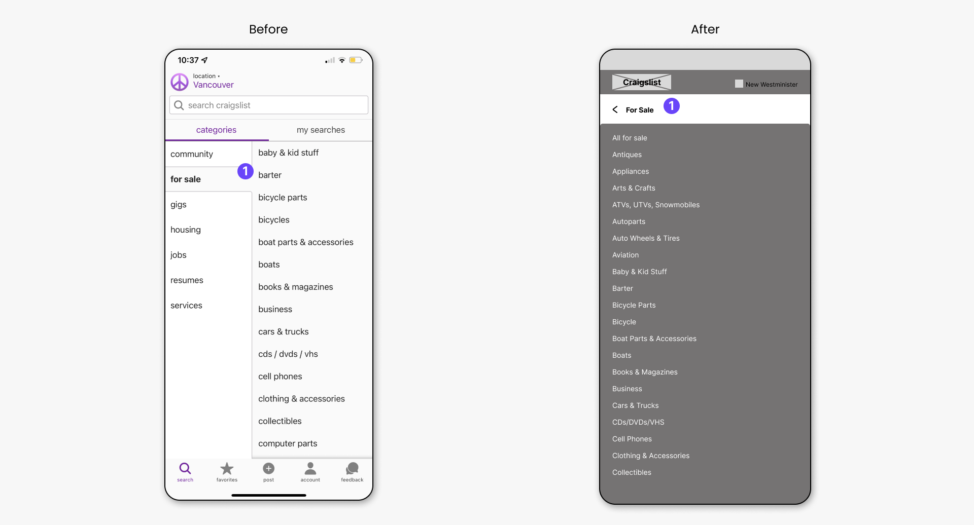
Search/Categories/Subcategories
- To allow for possible longer sub-categories, instead of having both the categories and subcategories side by side, the subcategories are moved to its own screen.
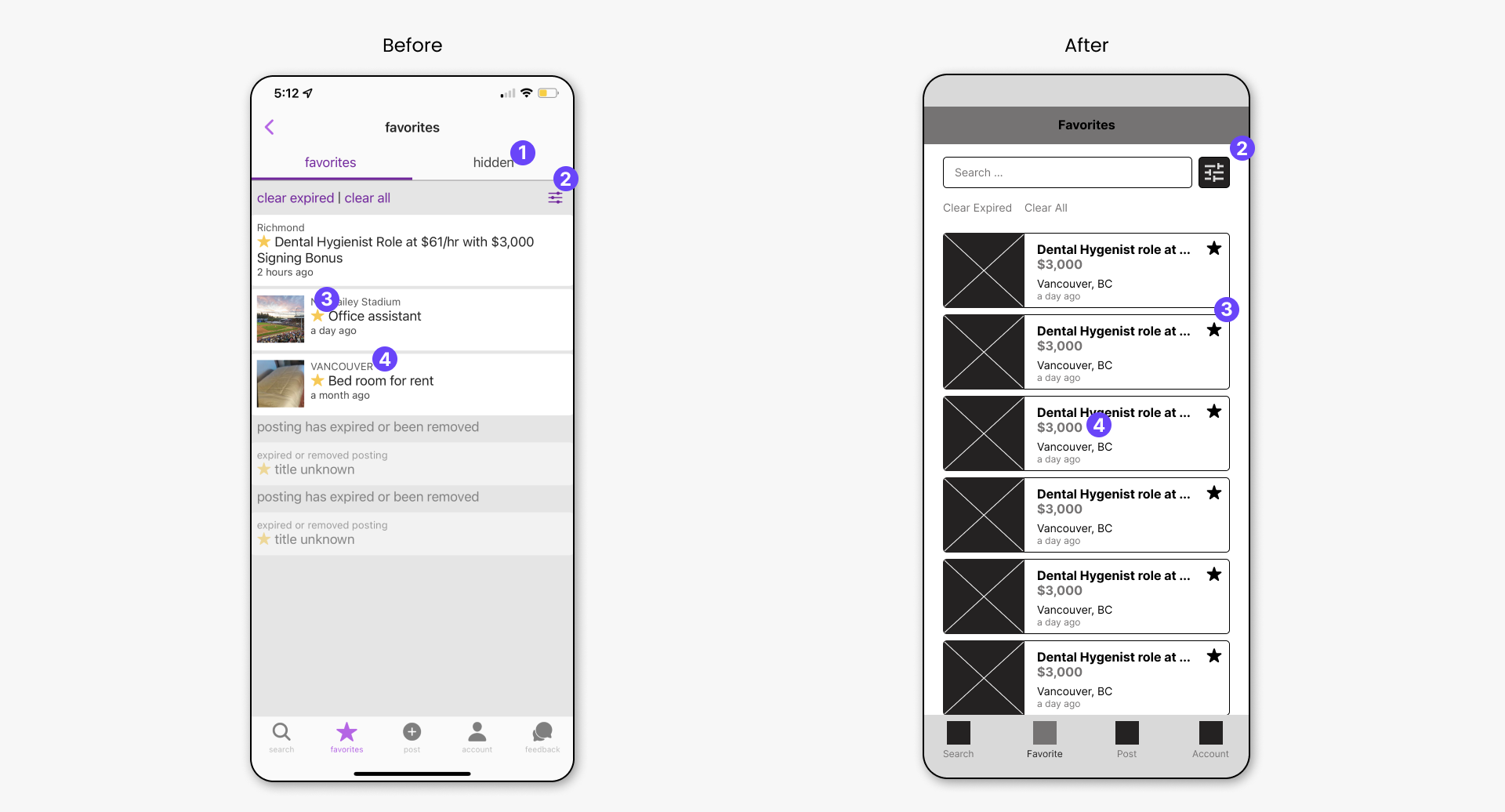
Favorites
- The “Hidden” section was moved to the “Account” section of the app. The “Hidden” section has no relation to the “favorites” section.
- A search bar is added so that the user can search in their list of favorites. The filter button is moved beside the search bar.
- The favorite star is moved to the side and is clickable if the user needs to unfavorite a listing.
- The price is made visible so that the user can easily compare listings if needed.
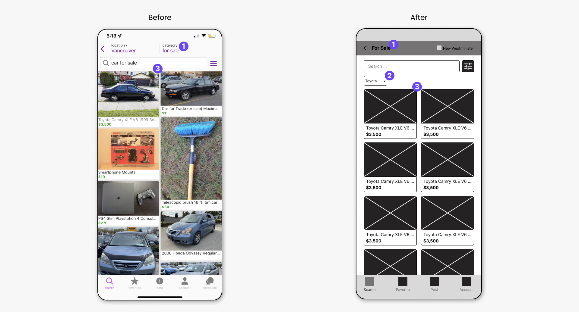
Search/Search Result
- The category of the listings is made the page title.
- This is a filter applied to the search. If there are multiple, they will be listed horizontally and will scroll from left to right.
- For this listing view, the images are cropped to a set size to make the layout grid uniform.
Search/Search Result/Listing
- This option has been removed because the user can simply dismiss the viewing of the listing and select another one to view.
- The price is made visible for the user.
- The location in the listing details is made clickable, which would direct the user into their default Map application. This method makes the map in the original screenshot redundant.
- Users can easily identify the favorite button to favorite a listing.
- Users can easily view the contact info of the listing owner now that it is made visible in the listing details. If they so wish, they can easily call or email the owner using the sticky Call and Email buttons.
- The “hide” button is moved in the additional options section
- Additional options menu items
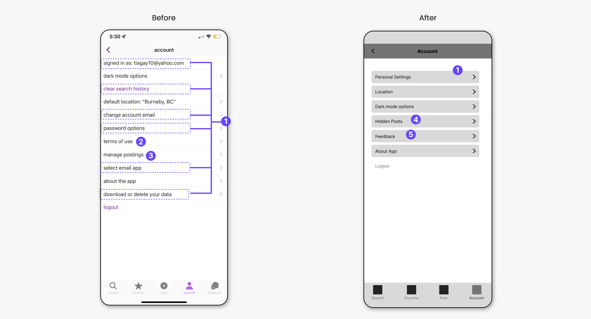
Account
- From the original screenshot, these items were moved into one section called “Personal Settings” as seen in the new design.
- Terms of use is redundant in this section because “About the App” also has the terms of use.
- “Manage Posting” is not needed here because it only takes the user to the “Post” section of the app.
- “Hidden Post” is moved here from the “Favorites” section.
- “Feedback” is moved from the bottom navbar, into this section.
Account/Personal Settings Screen
- User can see the email they used to sign in and change it if necessary.
- Dropdown menu options for email app options
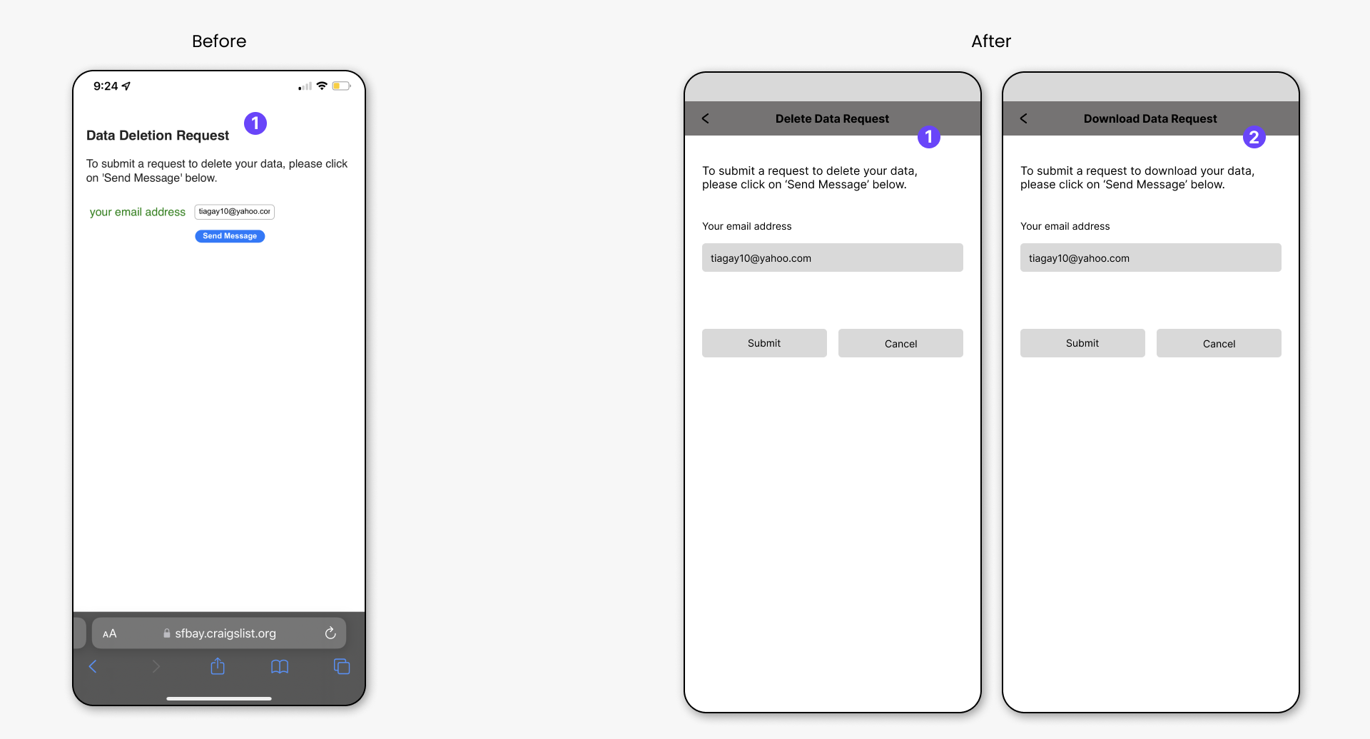
Account/Personal Settings/Delete&Download Data Request
- From the original screenshot, the Data Deletion Request is a web page. It is now made into a mobile screen in the new version.
- The Download Data Request is also now designed for mobile screen.
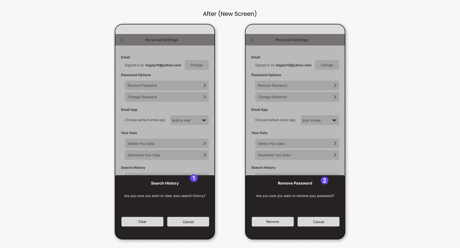
Account/Personal Settings/Search History&Remove Password
- The original design does not confirm the user choice to clear their search history. Therefore, this section is to confirm the user’s choice.
- The original design does not confirm the user choice to remove their password. Therefore, this section is to confirm the user’s choice.
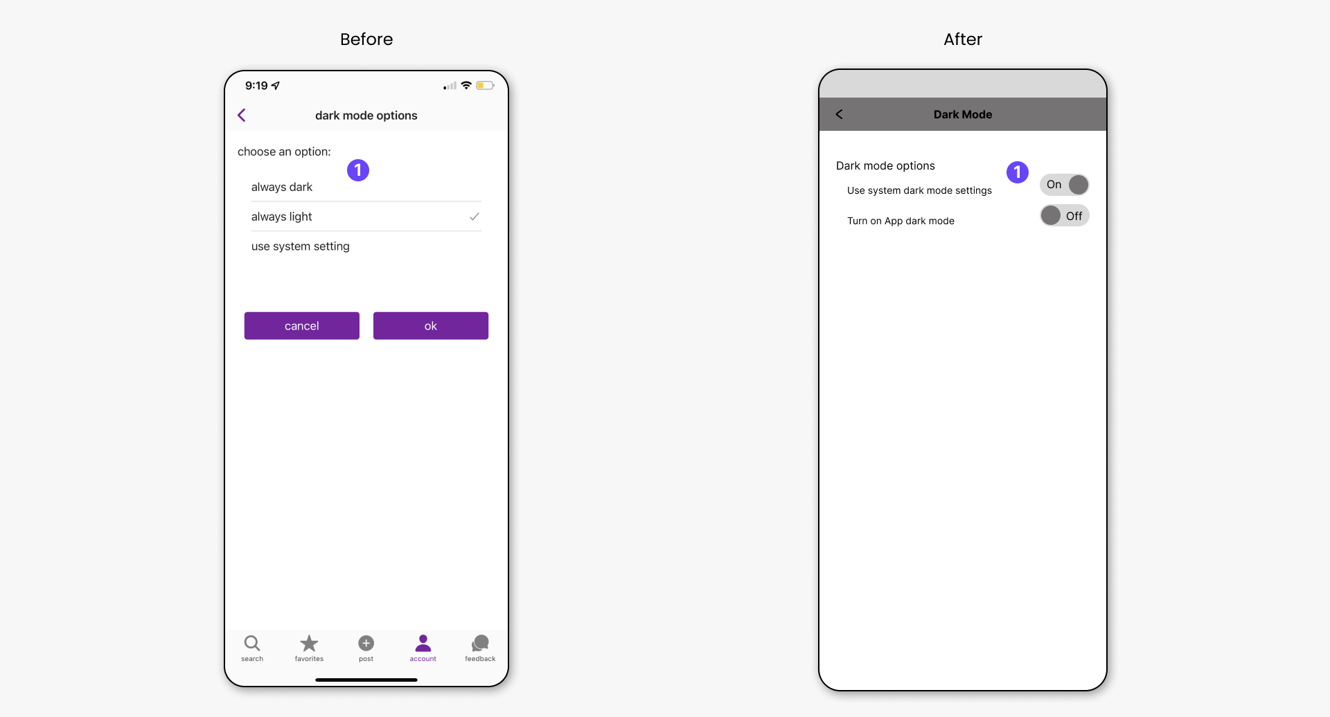
Account/Dark Mode
- Instead of giving the user 3 options, the new design gives them two options. However, only one can be set to “ON” at a given time.