Freedom Mobile

Overview
Freedom Mobile is a wireless telecommunications provider in Canada. It is the 4th largest provider in Canada.
Role
UI Designer
Tools
Figma
Problem Analysis
Some of the issues I found are as follows:
- Confusing flow
- Main sections are dropdown lists which results in continuous scrolling
- The grey colour for the background makes the app dull
My Solution
The idea behind the redesign of this application is to make the user feel like they are using a mobile app and not just a website on a mobile phone. A lot of the screens for the mobile app are in fact webpages inside the app.
Additionally, I wanted the app to feel lightweight which is why I used the light blue colour as the background and also white.
Current Design vs My UI Redesign
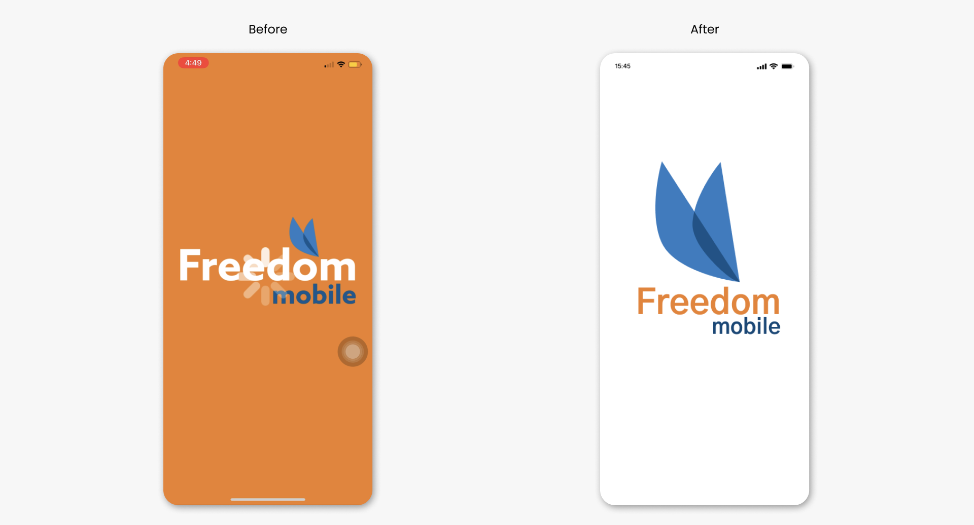
The idea behind the redesign of the splash screen is to make it easier on the eyes and place more emphasis on the logo mark.
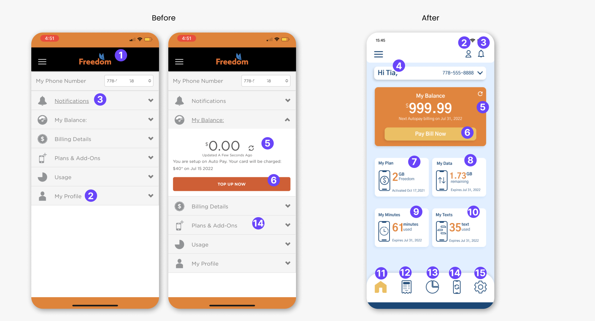
For the Home screen, I have decided to give the user a glimpse of some of the information that may be important to them. This is in contrast to the original design where users can access all the information from the dropdown sections of the home screen. I also created a bottom nav in order for users to have easy access to the app’s main features.
- The logo was removed in order to create some breathing room for the Profile and Notification icon.
- The profile section was moved to the top navbar as this is where most users expect it to be.
- The notification section was also moved to the top nav because this is also the expected location for users.
- Adding this personalised greeting here makes the user feel a bit more homey and gives the user a sense of ownership.
- I have placed some emphasis on the “My Balance” section by recreating it as a card and highlighting it with the orange colour of the brand.
- I also renamed the the Top Up Now button to “Pay Bill Now” because the balance is for the user’s bill
- This shows what Postpaid plan the user has.
- The remaining data for their plan
- The amount of text sent during the current bill cycle
- The amount of call minutes used during the current bill cycle
- Home icon is active so it become a filled yellow icon. Otherwise, it is blue outlined.
- Bill Icon for the billing screen
- Usage icon for the usage screen
- Subscription icon – this section was renamed from Plans & Add-Ons because it may the original name may confuse the user if they are looking for the section to purchase a plan or add on.
- Settings – not in the original design
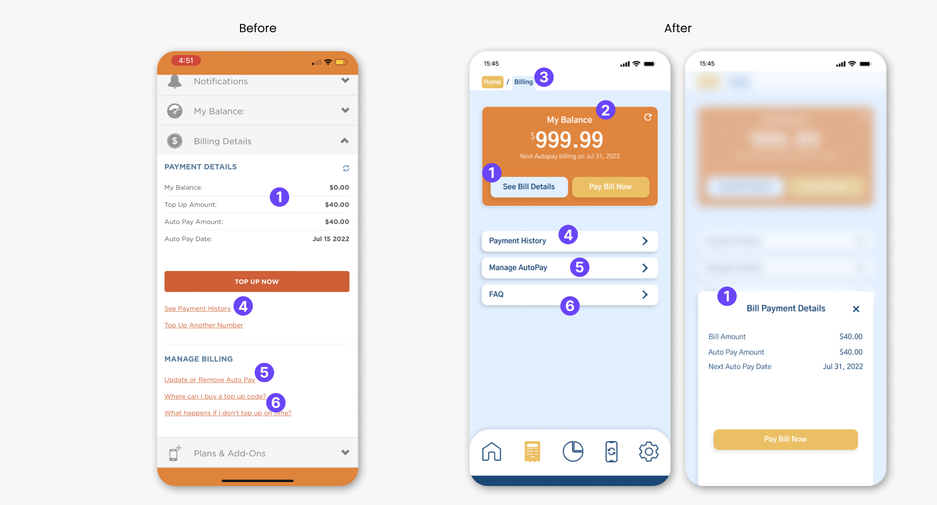
For the Billing Screen, I took the information that was in the billing section of the home screen from the original design and placed them on a separate screen for the new design.
- The Payment details section is visible when the user selects “See Bill Details” button in the “My Balance” card. I used a drawer instead of a dialog/pop up because this is more cleaner.
- The My Balance card was brought over from the home screen/balance section in the original design and into the Billing screen here in the new design. This is because the balance is for the user’s bill. It is also showing the next billing date.
- I used a breadcrumb here because the app can be big and it may help users to easily backtrack if the need to.
- This leads to Payment History for the user
- This navigates to Manage autopay so users can update or remove autopay.
- Instead of listing out these two links, I have put them iin one section which is the FAQ (Frequently asked questions) section
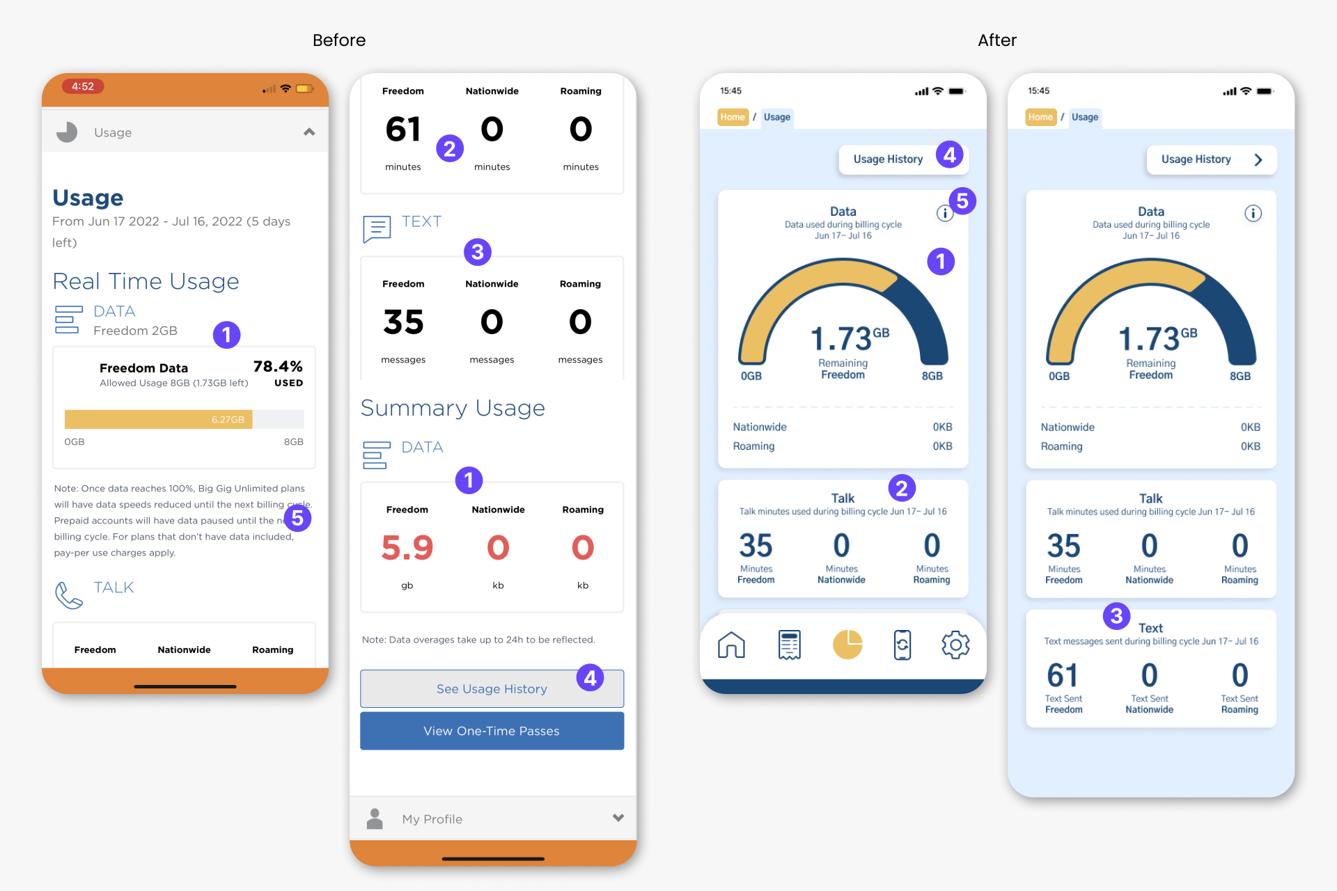
- For the Data card in the redesign, I combined the data section and the summary usage section of the original design. This is to reduce some redundant information and possible confusion.
- The talk card is similar to the original design however, instead of the user having to look at the top of the card then the bottom of the card to figure out what this number is for, I have placed the network and unit together.
- The Text card is same as the idea behind the Talk card.
- User’s usage history
- Instead of the user seeing the note details right away (old design), they now have to click the info icon to get that information.
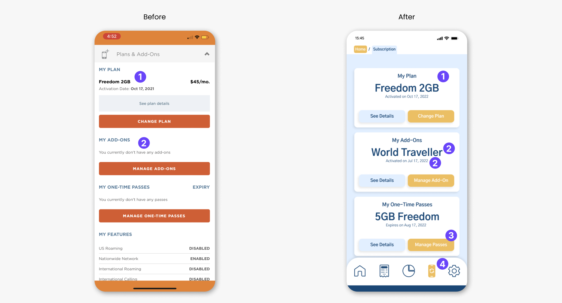
The idea behind the subscription section is to show the user what plans and other products they have subscribe to.In other words, the postpaid plan they have and any active add-ons or one-time passes.
- User’s postpaid plan
- User’s active add-on name and the activation date.
- Button to manage passes
- Active Subscription icon
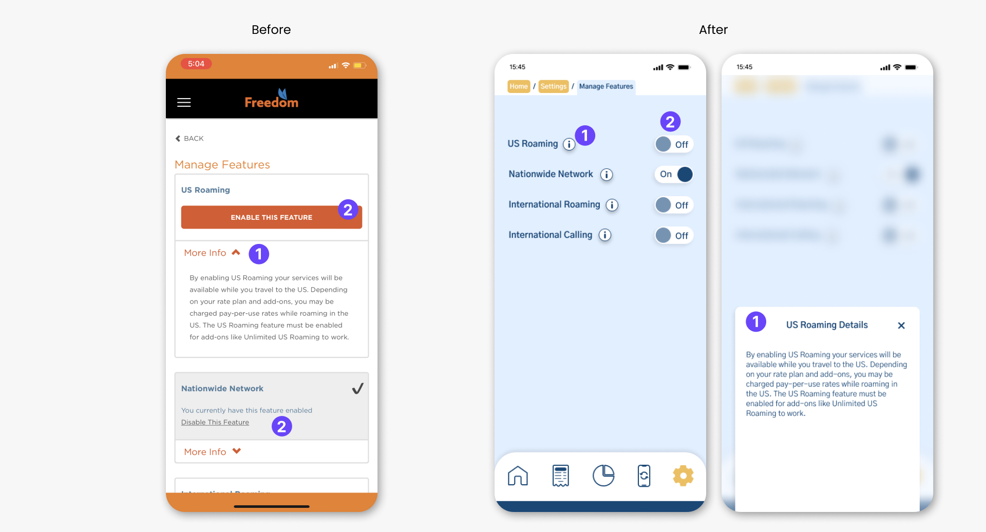
- For the redesign, the user has to click the info icon in order to see the details of the feature. In the new design it is shown as a drawer instead of a dropdown
- Instead of the enable button, I have used the toggle which easily allows the user to turn on or off a feature.
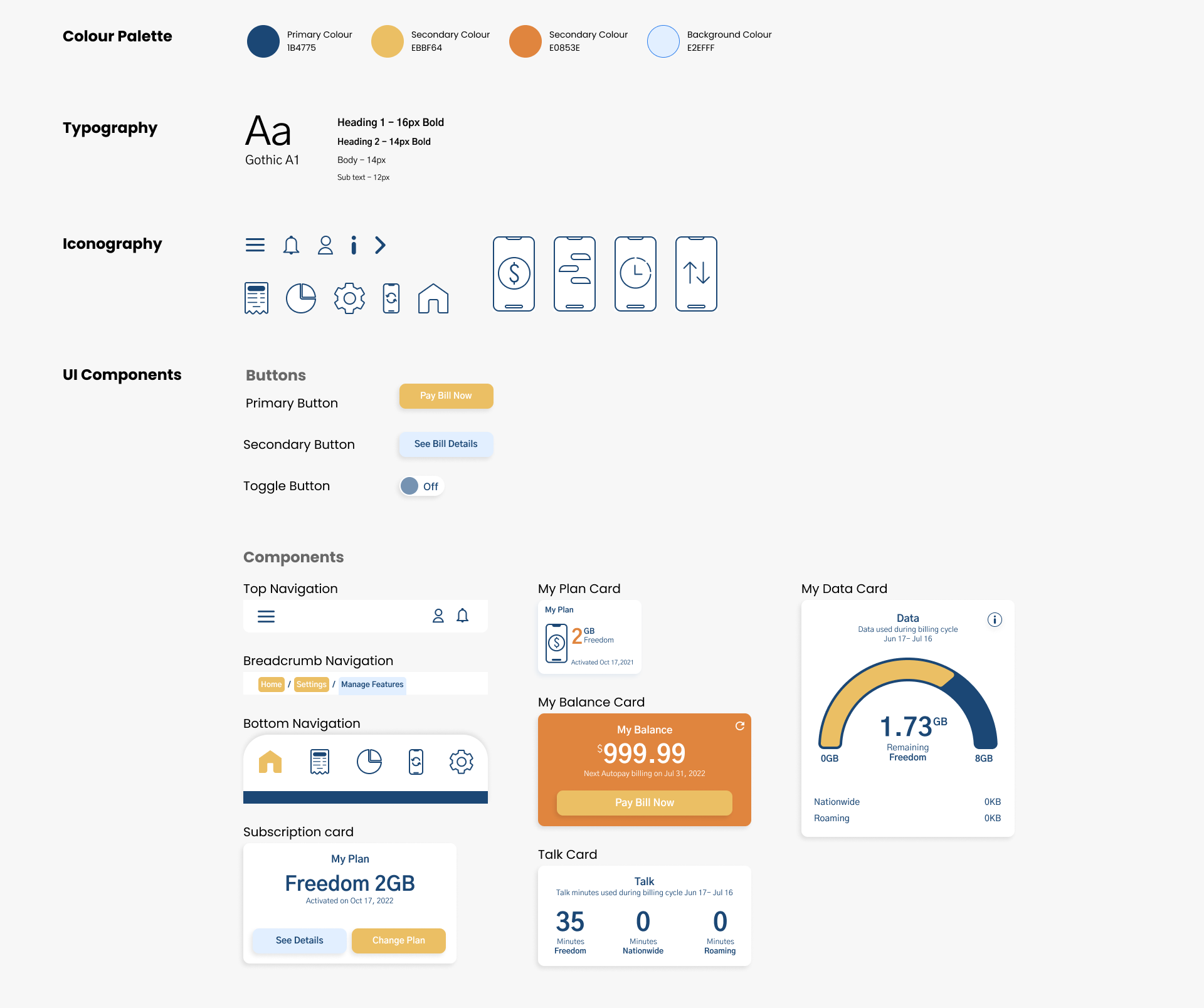
UI Kit