
University of Louisiana

Overview
The University of Louisiana at Lafayette is a public research university in Lafayette, Louisiana. It has the largest enrollment within the nine-campus University of Louisiana System and the second largest enrollment in Louisiana, behind only Louisiana State University.
Role
UI Designer
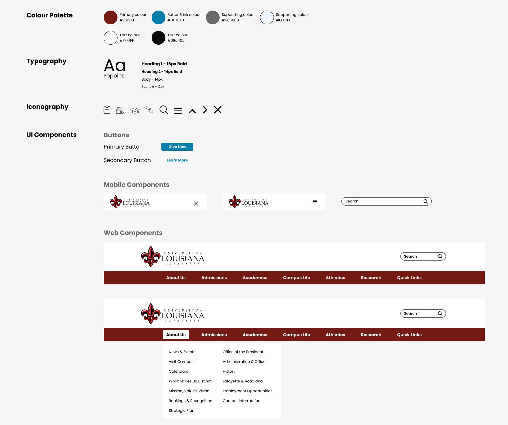
Tools
Figma
Problem Analysis
The issues I found with this website are as follows:
- The theme of the website is old fashion
- The layout needs a refresh
- The colour red is over used in the header/menu
My Solution
- Redesign ULL’s website to have an up-to-date design.
- Preserve the branding of ULL’s website.
- Redesign the website’s header.
- Redesign the website’s menu.
Wireframe
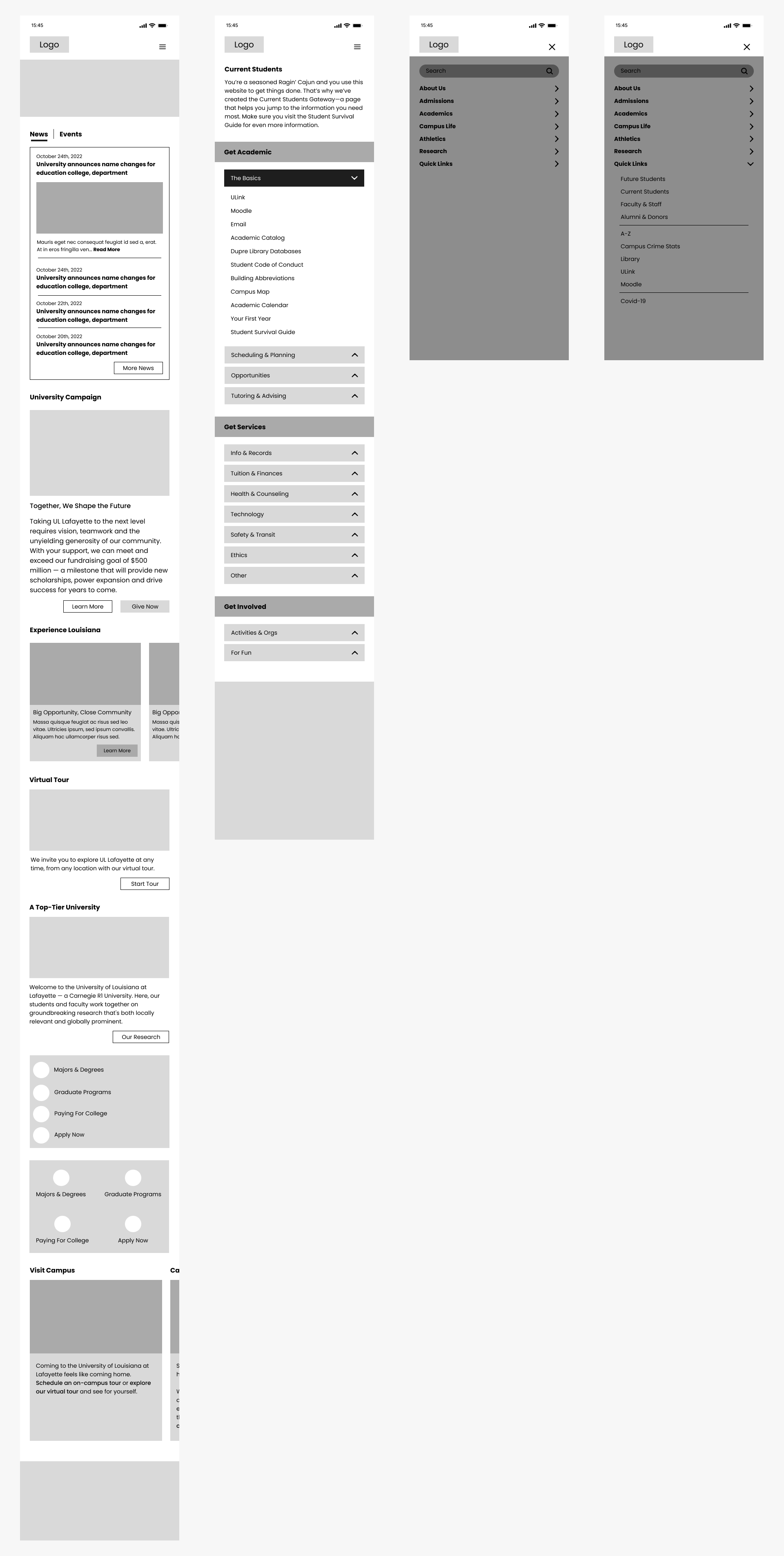
Mobile Wireframe
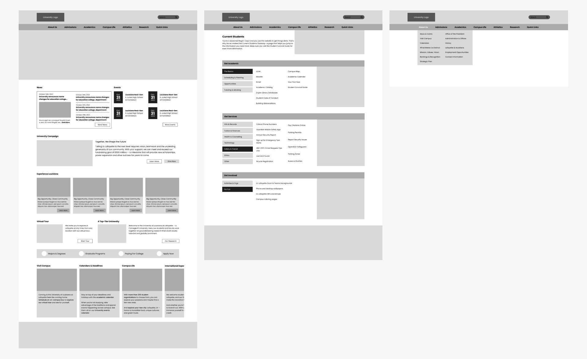
Web Wireframe
Current Version vs My UI Redesign
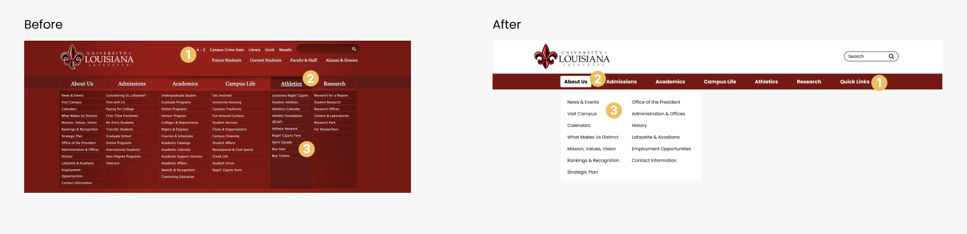
Header & Navigation – Web
The aim of the redesign for the navigation and header was to simplify it by removing a layer, and making it feel lighter by contolling the amount of information is being shown as well as the colour.
- Instead of having all the links crowd the header, I have placed them in the “Quick Links” section of the navigation
- In the navigation, the menu item that is being viewed is easily identified compared to the original menu.
- Only one list of options will be shown for the menu items, instead of all at once. This will help the user not to feel overwhelmed
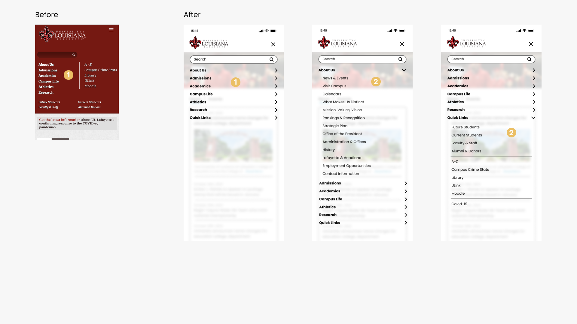
Redesign Header & Navigation – Mobile
The original mobile version of the menu is not expandable in order too see the different menu options under each section. Therefore, my aim for the mobile menu was to design a mobile navigation that gives the same options and has the same feel as the website.
- In the original version, the navigation makes the screen longer when it is accessed. However, in the redesign, it opens as an overlay over the screen and provides each menu options and their sub menu options below when clicked
- The submenu options
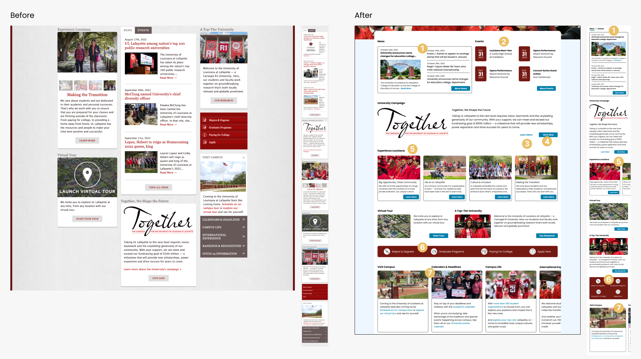
Home Body – Web & Mobile
The body section of the home page is organized as columns like a newspaper article. With the layout, users may become overwhelmed with the amount of information they are being shown at a given time. Also, this layout makes the content seems like it is being squuezed in to fit because it is limited by the column width. This may not be the best layout method because website are more generous with horizontal spacing than mobile devices.
Therefore, the aim of this section’s redesign is to maximise on the horizontal spacing.
For this page, the order of the sections was determined by the order of the original mobile screen. The aim of the mobile screen is to cut down on the amount of scrolling the user has to do.
- The news section highlights only one of the latest news while showing the heading & date of 3 others. In the mobile screen, it is shown as a tab view while web shows it as two separate sections. The original design shows both web & mobile as a tab view.
- The event section highlighting the dates of the events.
- Secondary button
- Use of the primary button with secondary button
- This section is expanded in the mobile but is viewed as a carousel in the mobile view.
- In the original version, this section is shown as a vertical menu list
- On the original website, this section is shown as a collapsable list, I decided to make it into a slider.
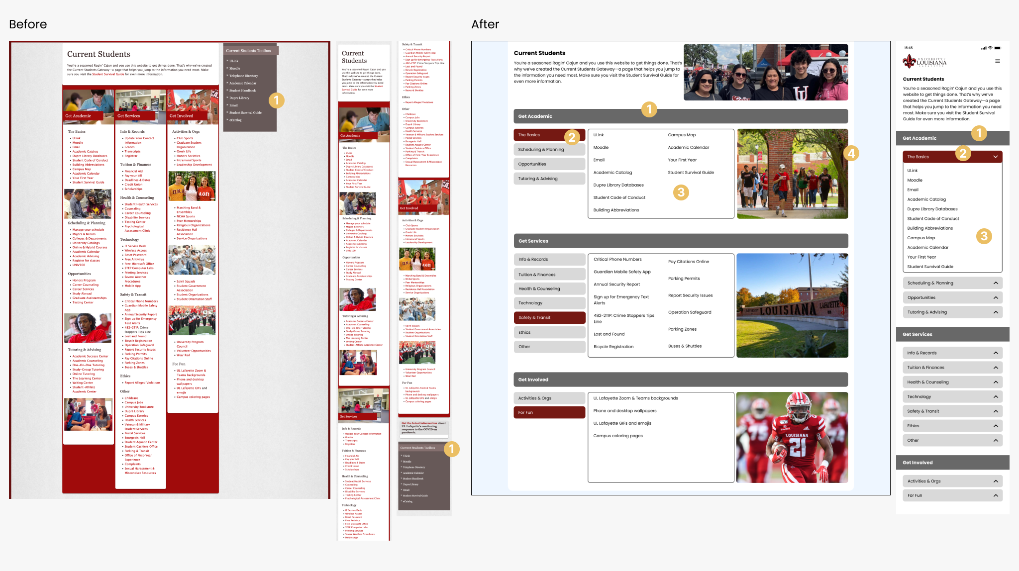
Current Student Page – Web & Mobile
For this page, as with the home page, it uses a column layout. The aim of this page’s redesign is to not crowd the user with too much information, and with the mobile version, to also minimise on scrolling.
- This section is redundant because it is a repetition of the links from the “Get Academic-The Basics” section. And for the mobile, it is at the bottomo of the screen, therefore it will be missed by the user because the page is already long and they might not scroll all the way to the bottom of the page to find that menu.
Redesign Student Page – Web & Mobile
With this redesign, both the web and mobile pages are shorter in length, especially the mobile screen.
- Section header for each of the 3 sections
- Selected submenu. in the mobile version it is shown as a dropdown component
- Submenu options. For the website, there is always one active submenu showing the menu options. For mobile, none of the dropdowns are expanded until the user clicks on the submenu title.
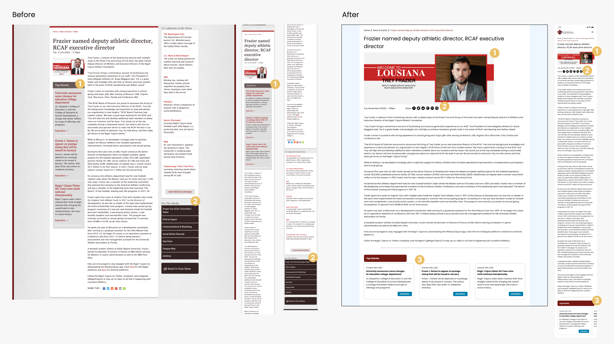
Current News Article Single Page – Web & Mobile
For this page, it has a lot of information that is unrelated to the article itself. Therefore, the aim for this redesign is to remove all the elements on this page so that it feels lighter and better organise the contents
- For this section, it is badly placed, especially for the mobile screen where it appears below the article photo but before the article content making it seem as if it is related to the article itself.
- These two sections are unrelated to the post but are available from the home page of the News & Events page.
Redesign News Article Single Page – Web & Mobile
- The image for the article is made more evident because it is related to the article
- The share options are moved further up the article so that the user does not need to scroll all the way to the bottom of the article to find the option to share.
- Contents for the top story section was kept because it is also good to show the users other article they may be interested it. In the mobile version it is presented as a carousel/horizontal slider.
UI Kit