
MiPatty
Client
Newly formed bakery in Vancouver, BC, Canada. The goal is to provide a taste of the Caribbean through one of its most loved delicacies in Jamaica, patty, by offering it in different flavour fillings, making it a great snack on the go or a breakfast/lunch meal.
Role
Sole Designer
Tools
Adobe Illustrator, Photoshop
Brand Strategy
- Target Audience: Male & Female ages 25-35yrs old
Interests: eating out, exploring different cultures - Design/Brand Personality: Neutral to men & women, vibrant, playful, sincere, welcoming, dependable, wholesome
- Goal: to sell patty products in big retailers, open a bakery that makes and sells the patty products so consumers can come in and enjoy freshly baked patties
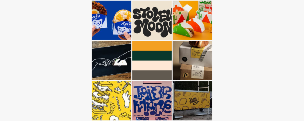
MoodBoard
Typography
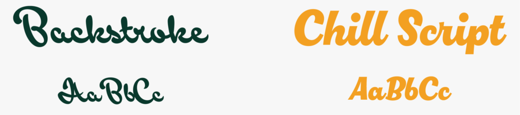
Both the Backstroke font and the Chill Script font were used as inspiration for the creation of the brand logo. The backstroke font was used for the “Mi” and Chill Script font for “Patty”. These fonts were not used in their original form, but as a basis for the logo. They were chosen because they matched the brand personality which is playful & vibrant.
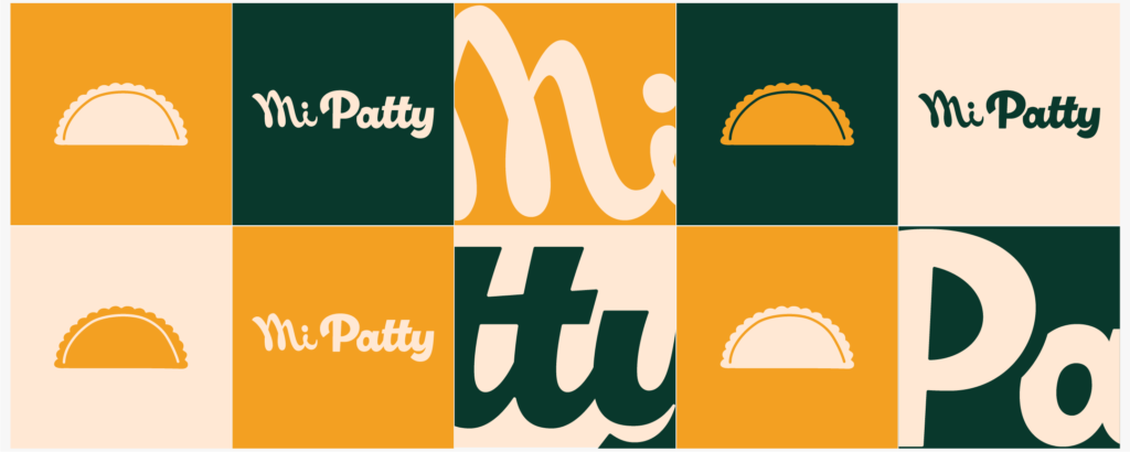
Colour Palette

The colours chosen were green, cream and yellow. Both the green and yellow represents the Jamaican colours. The cream is used as a tertiary colour for mainly background colour, the yellow as the secondary colour to highlight important elements and the green as the primary colour.
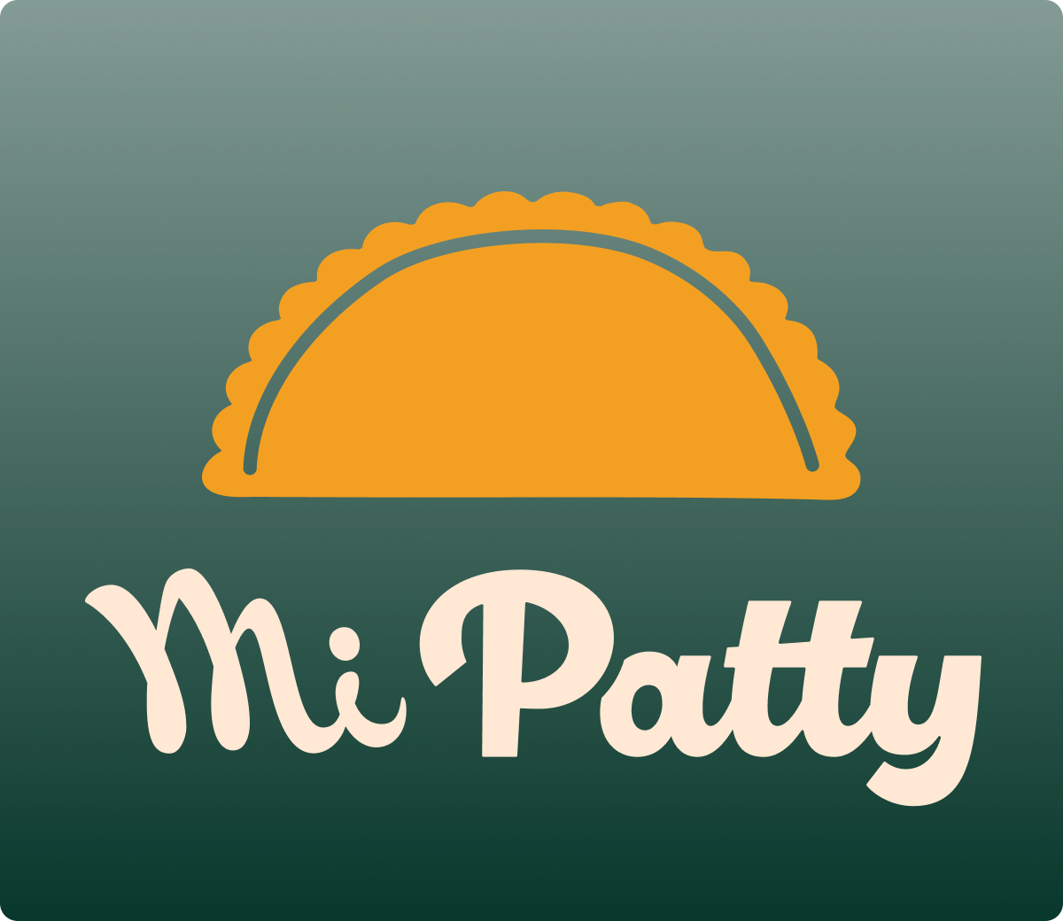
Logo
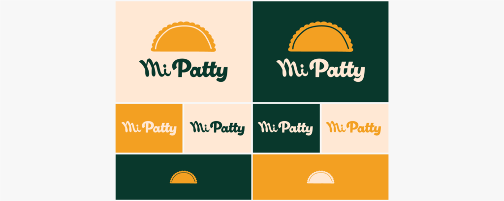
The logo consists of a logo type “MiPatty” and logo mark -patty illustration.
For the logo, a yellow patty logo mark must be used with either a green or cream coloured “MiPatty” logo type. By itself, the logo type can be any of the 3 colours while the logo mark is either yellow or cream.
Mockup
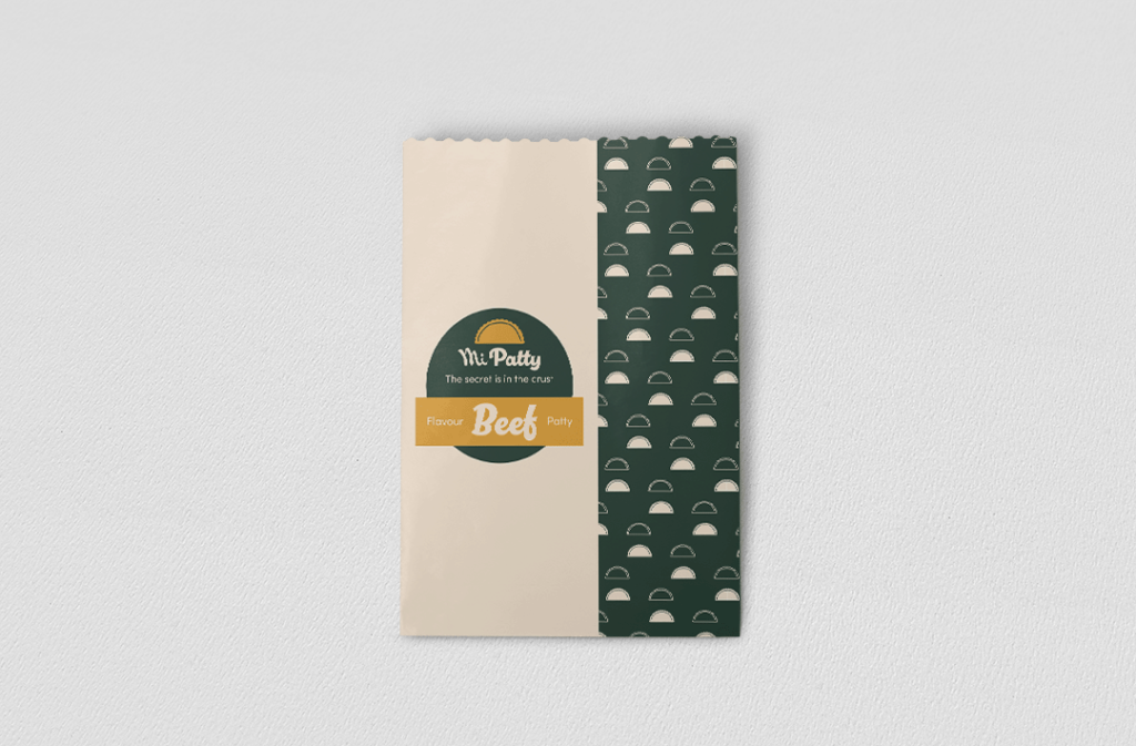
Patty Bag Mockup
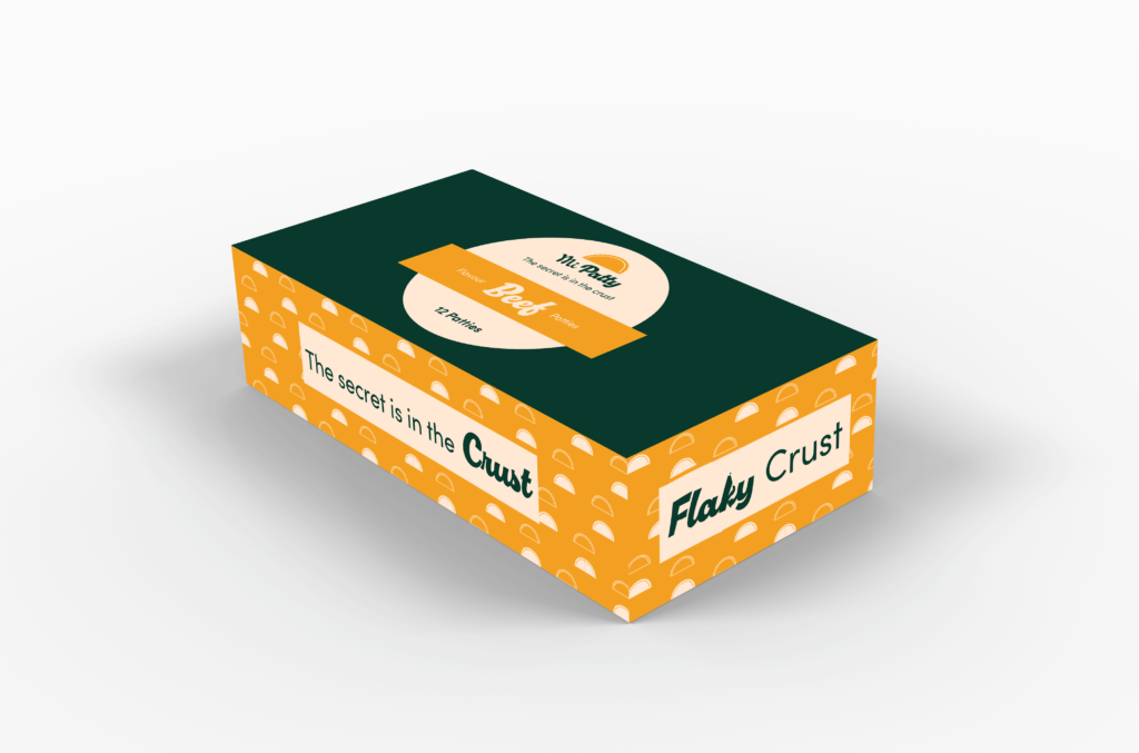
Patty Box Mockup
Design Assets
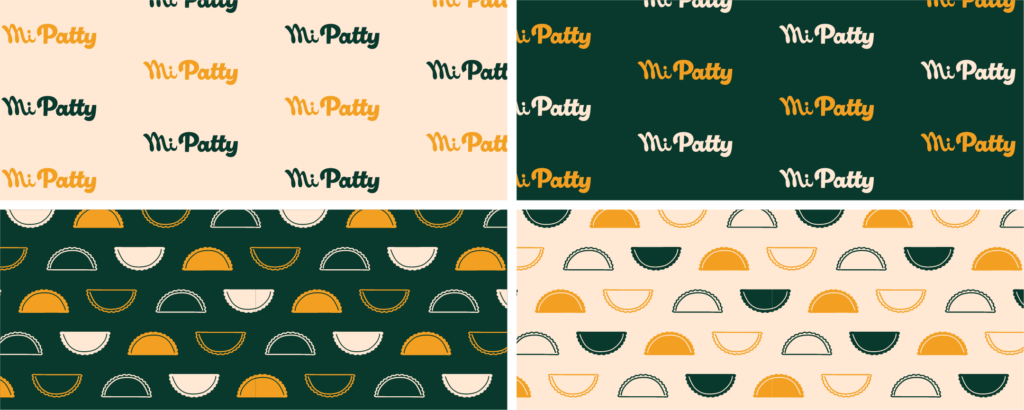
Brand Pattern